Color theory is the study of how colors interact and how they can be used to create visual effects. It is based on the idea that colors can be combined and arranged in certain ways to create different moods and effects.
There are three primary colors: red, yellow, and blue. These colors cannot be created by mixing other colors together, and they are the basis for all other colors.
Secondary colors are created by mixing two primary colors together. For example, mixing red and yellow creates orange, mixing red and blue creates purple, and mixing yellow and blue creates green.
Tertiary colors are created by mixing a primary color and a secondary color together. For example, mixing red and orange creates red-orange, mixing blue and green creates blue-green, and mixing yellow and orange creates yellow-orange.
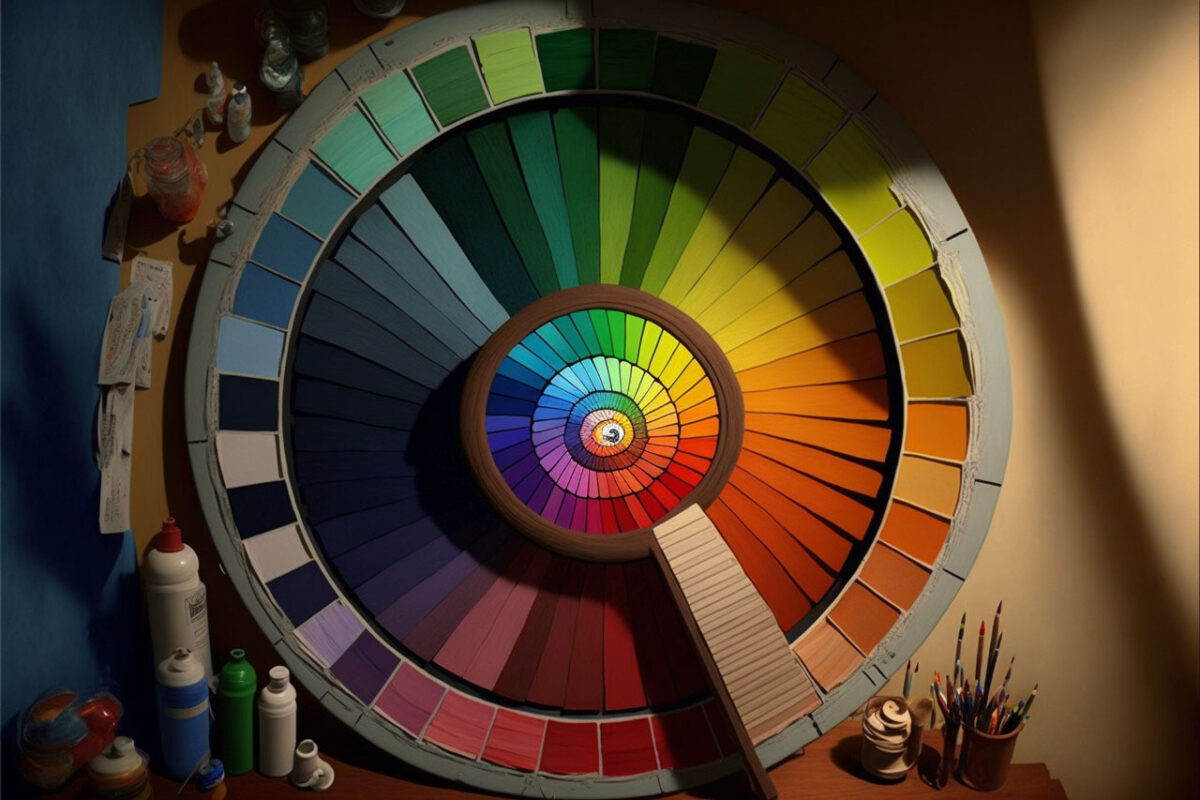
Color theory also includes the concept of complementary colors, which are colors that are opposite each other on the color wheel. For example, red and green are complementary colors, as are blue and orange, and yellow and purple. When used together, complementary colors can create a vibrant and eye-catching effect.
Color theory is the study of how colors interact and how they can be used to create visual effects. Color has been used throughout all of art history to establish mood and theme in design/ It is based on the idea that colors can be combined and arranged in certain ways to create different moods and effects, and is an important tool for artists, designers, and anyone else who works with color.
The Primary Colors
The primary colors are the colors that cannot be created by mixing other colors together, and are the basis for all other colors. The primary colors are red, yellow, and blue.

Red, yellow, and blue are called the primary colors because they are the colors that are most pure and cannot be created by mixing other colors together. These colors are the foundation of the color wheel, and all other colors can be created by mixing different combinations of red, yellow, and blue.
Each primary color has its own unique properties and characteristics. Red is a warm and energetic color, associated with passion and excitement. Yellow is a bright and cheerful color, associated with happiness and joy. Blue is a cool and calming color, associated with serenity and peace.
When used together, the primary colors can create a wide range of different colors and effects. For example, mixing red and yellow creates orange, mixing red and blue creates purple, and mixing yellow and blue creates green. These secondary colors can then be mixed with each other and with the primary colors to create even more colors, such as red-orange, blue-green, and yellow-orange.
The Secondary Colors
The secondary colors are the colors that are created by mixing two primary colors together. The secondary colors are orange, purple, and green.
Orange is created by mixing red and yellow, purple is created by mixing red and blue, and green is created by mixing blue and yellow. Each of these colors has its own unique properties and characteristics, and can be used in different ways to create different effects.

Orange is a warm and energetic color, associated with excitement and enthusiasm. Purple is a rich and royal color, associated with luxury and sophistication. Green is a refreshing and natural color, associated with growth and abundance.
When used together, the secondary colors can create a wide range of different colors and effects. For example, mixing orange and purple creates red-orange, mixing purple and green creates blue-green, and mixing orange and green creates yellow-orange. These tertiary colors can then be mixed with each other and with the primary and secondary colors to create even more colors, such as red-orange-yellow, blue-green-purple, and yellow-orange-green.
The Complementary Colors
Complementary colors are colors that are opposite each other on the color wheel. Complementary colors are often used together in art and design to create a vibrant and eye-catching effect.
The primary colors, red, yellow, and blue, are opposite each other on the color wheel. This means that red is opposite to green, yellow is opposite to purple, and blue is opposite to orange. These pairs of colors are called complementary colors, and when used together, they can create a vibrant and striking effect.
Complementary colors are often used together in art and design to create a sense of contrast and balance. For example, a painting may use a combination of blue and orange to create a vibrant and dynamic effect, or a graphic design may use a combination of purple and yellow to create a bold and eye-catching look.
Complementary colors can also be used to create optical illusions and other visual effects. For example, using a combination of blue and orange can make an object appear to move or change shape, and using a combination of purple and yellow can make an object appear to be closer or further away.
Overall, complementary colors are colors that are opposite each other on the color wheel, and are often used together in art and design to create a vibrant and eye-catching effect. Complementary colors can also be used to create optical illusions and other visual effects, and are an important tool for artists, designers, and anyone else who works with color.
